project details
Compobin — Brand Identity
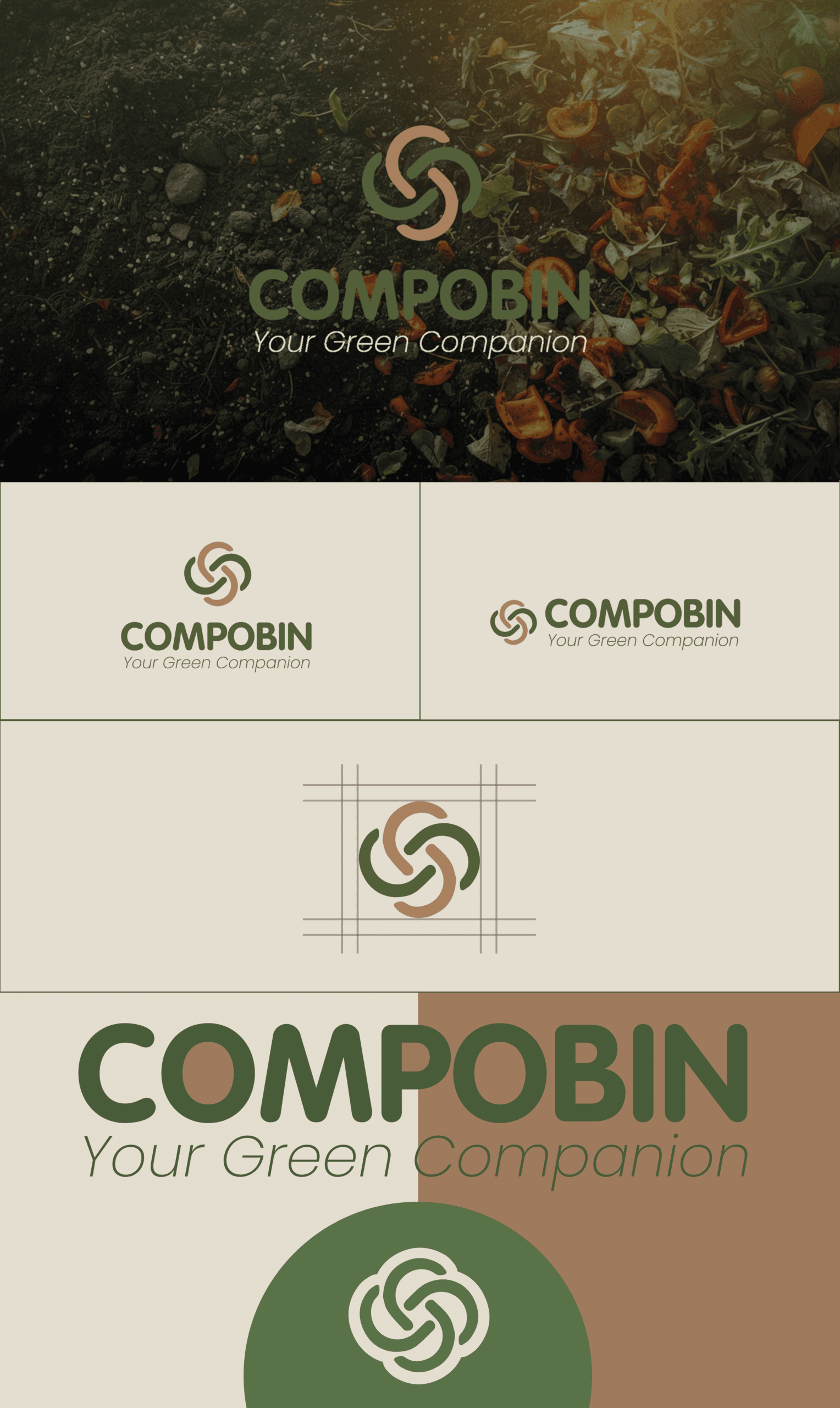
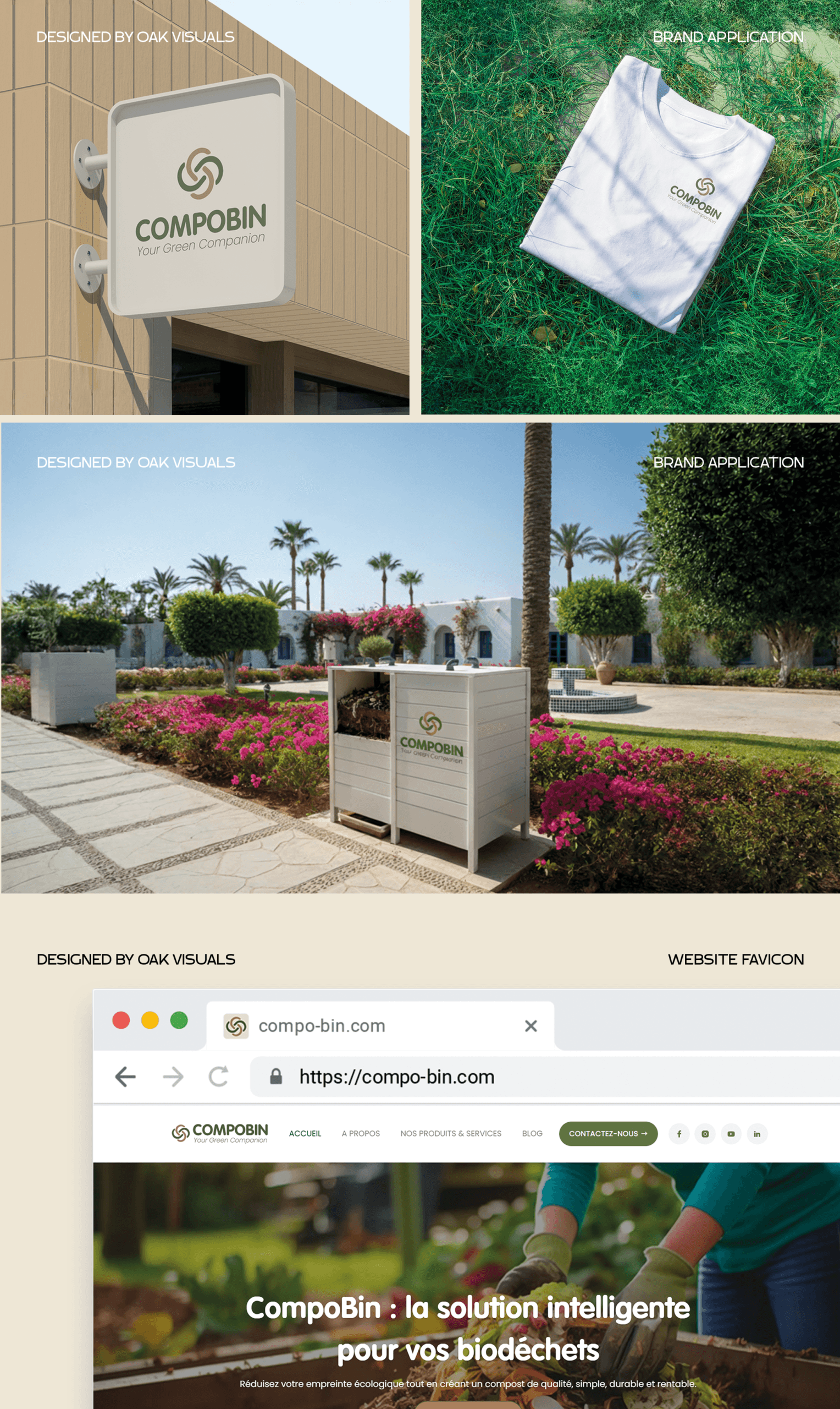
- Compobin is a sustainable brand built around the idea of nature, circularity, and responsible living. The brand identity was designed to reflect its mission as a “Green Companion”, combining environmental values with a modern, trustworthy, and approachable visual language.
- The logo mark symbolizes continuous growth, balance, and natural cycles, expressed through an organic, interconnected form that evokes unity and sustainability. The rounded geometry reinforces friendliness, while the structured construction ensures consistency and scalability across applications.
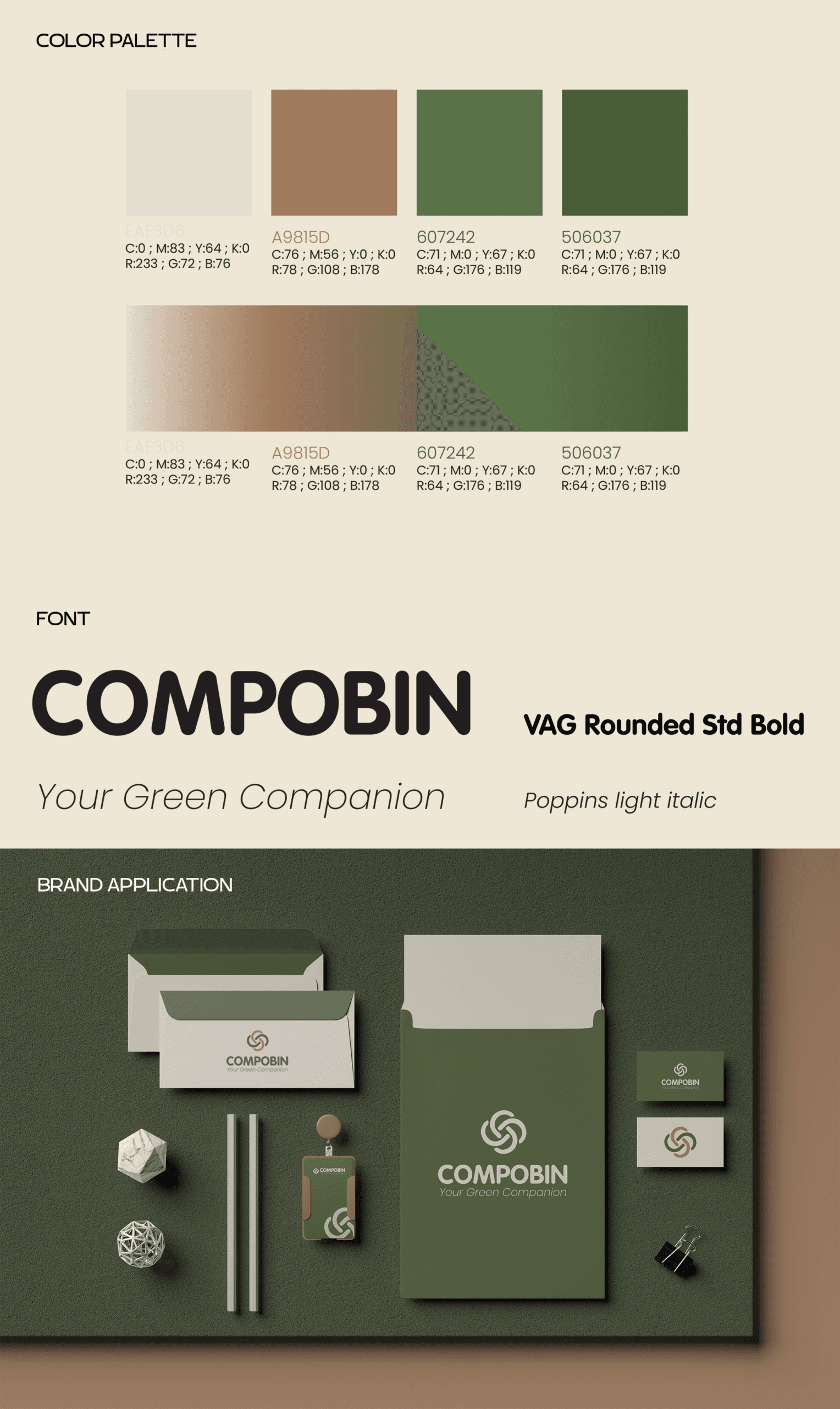
- The color palette is inspired by earthy greens, warm browns, and soft neutrals, representing nature, soil, renewal, and environmental responsibility. These tones create a calm, eco-conscious aesthetic while maintaining strong brand recognition.
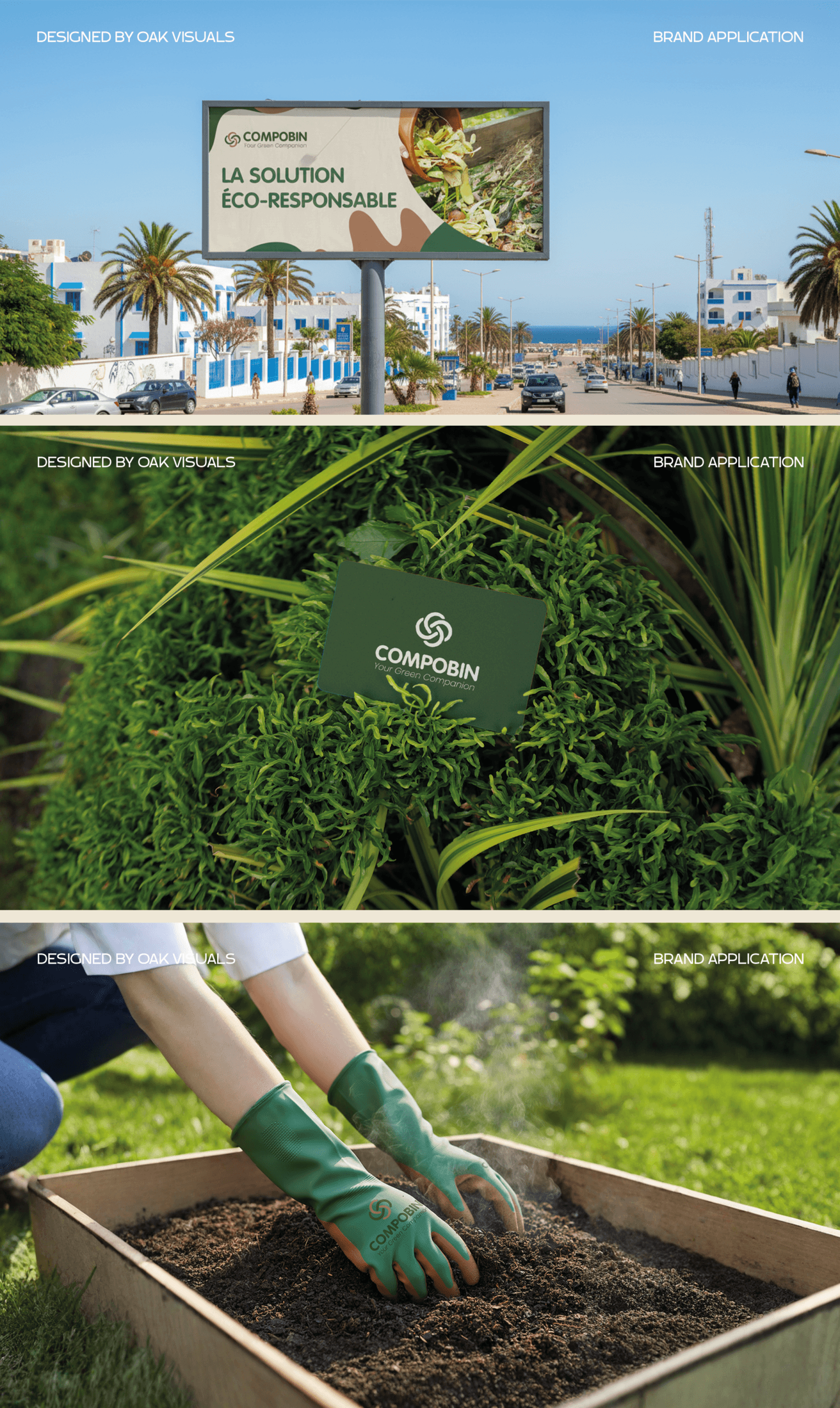
- Typography was selected to balance clarity and character, supporting a confident yet approachable tone of voice. The overall identity system is designed to be cohesive, flexible, and scalable, enabling Compobin to communicate its values clearly across digital and physical touchpoints.
This project delivers a complete visual identity system that positions Compobin as a credible, modern, and environmentally conscious brand.

