project details
Haus Harmony – Logo Design


Brand Identity
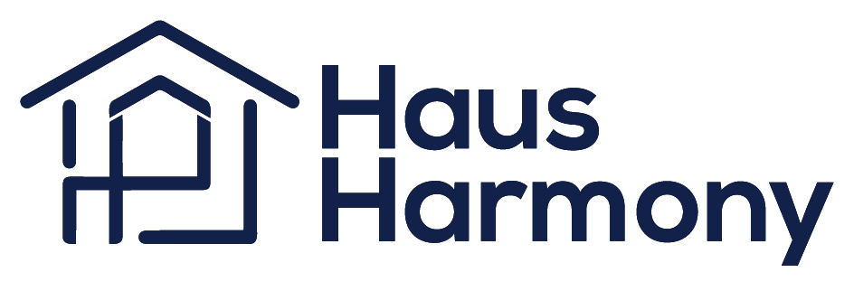
We created the Haus Harmony logo to visually represent the company’s mission: delivering harmony and professionalism across all home-related services. The design is based on a minimalist and structured approach, combining the visual of a house with the initials “H” and “H” to reflect both the name and the philosophy of the brand.
Main Logo:
Concept: The icon cleverly integrates the letters “H” and “H” into the outline of a house, symbolizing unity and structure.
Color: The primary navy blue conveys trust, stability, and professionalism—values that are fundamental to Haus Harmony.
Typography: We selected a clean and modern sans-serif typeface to ensure readability and reinforce a contemporary identity.
Sub-Unit Logos:
To bring structure and clarity to Haus Harmony’s wide range of services, we created a series of sub-unit logos. Each retains the main logo’s form but features a distinct color and service label. This modular identity system ensures consistency while providing each department with its own unique identity.
- Hausmeisterservice : 🔴 Red
We used red to represent responsiveness, maintenance, and active support. - Renovierung : 🔵 Blue
Blue stands for precision, reliability, and calm execution in renovation services. - Garten : 🟢 Green
Green symbolizes nature, growth, and eco-conscious care. - Umzug : 🟠 Orange
Orange communicates energy, efficiency, and dynamic movement in relocation services. - Interior und Gartendesign – 🟣 Purple
Purple evokes creativity, elegance, and thoughtful design in both interior and outdoor spaces.


